Using Global Climate Change as a Platform for Interpreting Graphical Data
 Ruggiero Golden JSE March 2017 Future Casting Issue PDF
Abstract: Scientific literacy through critical-thinking and problem-solving is an important part of the future of our nation. Understanding of science and engineering concepts creates informed citizens who can contribute to democratic conversations and be knowledge consumers. Scientific literacy also requires an understanding of data and data analysis. This lesson uses Global Climate Change as a platform for understanding graphical data by exploring the manipulations of graphs and helping students recognize the ways in which perspective and scale play a role in graphing data. The lesson provided is designed to be covered in 90 minutes with high school students. Using four graphs of global temperature change, students will work in groups to analyze graphs and recognize the way in which scaling can play an integral role in the perception of information as well as an understanding of the degree of temperature change over periods of time due to global climate change.
Keywords: Scientific literacy, climate change, graphs, data, lesson plan
Media reports about climate change have featured misleading representations of climate data. In early 2014, Representative Marsha Blackburn of Tennessee said “Look at what the warming is…we have gone from 320 ppm to 400 ppm…it’s very slight (NBC, 2014)”. Flurries of media headlines have invoked the notion of a “global warming pause” (Howard, 2014), implying that there has been no warming since 1998. While these incidents referred to actual scientific data, it points to a possibly purposeful misuse of those data in order to promote the idea that climate change is either a non-issue or at worst a marginal issue. Because of blatantly misleading media portrayals like these, it is necessary to teach K-12 lessons which purposefully problematize issues of analyzing graphic data.
In this article, we present a lesson designed to build the skills of data analysis, with particular emphasis on issues pertaining to the detection of misrepresentations of data.
This article describes one lesson which can provide examples of misrepresentation of data by changing the time scale as well as by changing the units of measurement, both of which are common techniques in global climate change graphs.
Leading scientific bodies in the United States, including the American Association for the Advancement of Science (1993) and the National Academies of Sciences (NRC 2012) have called for a shift in emphasis in K-12 science education towards a scientifically literate citizenry. This lesson is based on a relationship between scientific literacy and media information in that the interpretation of data that may or may not be represented accurately.
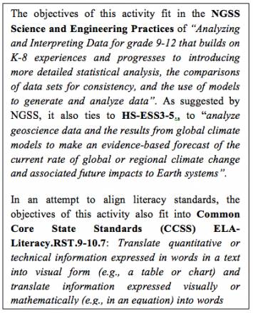
A common manipulation of graphs occurs when the topic of conversation is perceived to be controversial or if the author (intentionally or not) is guilty of relying on a statistical fallacy. In alignment with Next Generation Science Standards (NGSS), this activity builds upon the work of scholars (Golden, 2011; NRC 2011) who emphasize the use of GCC data to build the analytic and interpretation skills of students as early as middle school. This lesson is designed as a cross-cutting technique related to data analysis; therefore explicit content mastery of Global Climate Change is not critical prior to engagement in the lesson. While this lesson can be modified for various courses and grade levels, we deem it to be most appropriate to be taught in high school classrooms. The NGSS and CCSS Standards emphasized in this lesson are described in Figure 1 and Figure 2.
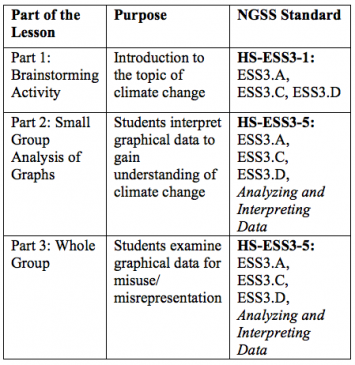
This lesson is divided into three parts: a whole group brainstorming activity to introduce the topic of global climate change, followed by a small group activity in which students gain basic understandings about climate change based on a variety of graphs, and concluded with a whole group analysis of the ways in which global climate change data is represented or misrepresented. Each section of the activity has suggestions for pacing and grouping of students.
Introduction: What do you know about Global Climate Change?
Before entering into the meat of the lesson, we suggest beginning by framing the issue of climate change, for purposes of this class, as one based on understanding the science behind it, not as a matter of political identity, or of simple belief in (or not). After breaking the students into groups of 3-4, the lesson is introduced with an engaging question: “What do you know about global climate change?”. Ask the students to brainstorm for 3-5 minutes, then commit their answers to a whiteboard or other similar display. Such a question helps the educator introduce the topic and learn what understandings that students may have, including misconceptions. We have found this to be particularly useful to use this engaging question as a brainstorming exercise and word association tool. Having students list the words they believe to be associated with global climate change (GCC) will provide the educator with a gateway into the lesson.
After they have written their ideas, have each group share some ideas with the whole class. Be sure to remind students that there is no penalty for “wrong answers” at this stage and that phrases or even single words will help the instructor understand what the students already know or are familiar with. We have found some common student replies include ‘temperature change’, ‘warming’, ‘atmosphere’, and ‘CO2’. Some students may be able to bridge these terms with little prompting. However, some students lump many ‘environmental’ things together and will tell you that ‘pollution’ and ‘recycling’ are directly related to GCC as well. These misconceptions are best addressed by explaining that there are many issues that scientists believe are caused by or effect global climate change but that there is no direct causal relationship. It is important for students to understand that for this activity we will be exploring a few aspects of GCC, that were mentioned in the opening exercise, in terms of global atmospheric temperature changes and levels of atmospheric CO2 by looking at data.
Part II: What do you understand about Climate Change Data?
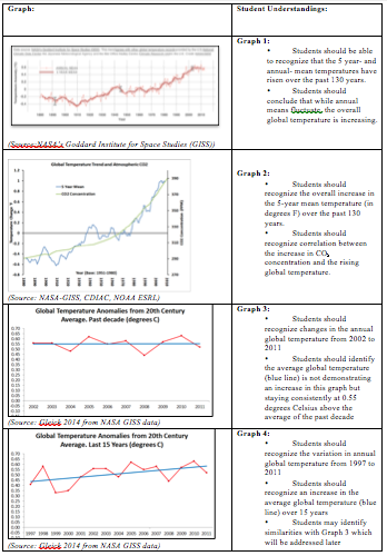
The next part of this lesson is a focus on four climate change graphs in terms of what students should understand about climate change. Students remain in their groups of 3-4, with each group receiving a different graph (see Graphs 1-4). Instruct students to examine the graphs with only the prompting question of “What can you tell/infer from the graph in from of you?” Have students brainstorm and/or think, pair, and share within their small groups.
In practice, it has been helpful to then prompt small groups to write down several things they ‘know’ by examining the graphs. After several minutes, rotate the graphs so that after a period of approximately 20 minutes all groups will have had the chance to examine and draw conclusions about each of the four graphs. Have each group develop their consensus on the information being presented to them. In returning back to the whole group, the educator can then summarize the major points for each graph in just a few minutes. The table below demonstrates the four graphs used for this lesson, as well as the information students should understand from each graph:
For the full set of graphs see: Ruggiero Golden JSE March 2017 Future Casting Issue PDF
Initially, there may be some useful confusion when the educator tells students that despite all of the graphs they examined looking drastically different, they were all derived from data collected by NASA’s Goddard Institute for Space Studies (GISS). We suggest then giving students all four graphs and approximately 5 more minutes to look over all of the information again and then have small group discussion for 10 minutes in which students will try to find the differences and similarities between the sets of graphs. It is crucial to guide students into examining the x-and y-axis differences, Fahrenheit versus Celsius, and time scales such as 9 years in Graph 3 versus a 130 year time span in Graph 1 and 2.
This will naturally flow into the idea of “scaling” and “perspective” in the visual representation of data with a little guidance from the instructor. Representative Blackburn was playing with the notion of scaling in the example used at the start of this article by implying that 320ppm to 400ppm is not a substantial change. Climate Scientist Bill Nye responded to Rep. Blackburn’s comment by saying that “You asserted, Congresswoman, that a change from 320 parts per million is insignificant. My goodness, that’s 30 percent. That’s an enormous change, and it’s changing the world and that’s just over the last few decades!” (NBC, 2014). Similarly in this lesson, the instructor should emphasize differences in the ways that the data are displayed and understood, for example over 10 years versus 100 years, and that that can dramatically change the way the graph looks and in turn, the way we perceive the information.
The core idea of this lesson is the idea that difference of both the scale of the time frame as well as the different unit of measurement (either Fahrenheit or Celsius) creates a situation in which the same raw data can appear dramatically different depending on how it is portrayed. It is important at this point in the lesson for the instructor to clarify that none of these graphs are ‘wrong’ but rather were created from real data to lead the viewer to make certain assumptions. It may be particularly helpful to reference the similarities and differences of Graphs 3 and 4, in which the author ‘cherry picked’ a certain time frame in order to show little to no global temperature increase. However, the same data displayed in Graph 1 and 2 over 130 years shows that while there are variation in annual global temperature, the larger picture shows substantial average global temperature increase and therefore substantiates global climate change (akin to the headlines about the alleged “Global Warming Pause”).
This lesson may seem at first to broach upon controversial and/or political subject matter. However, as indicated above, the teacher should focus on the science at hand, with emphasis upon the role of data analysis in science (and math!). It is useful though, to ask if the various interpretations may be of particular use to separate agendas, through asking “Who would change data to create a positive or negative reaction, and why”? A few great examples of this includes the above-mentioned media claims of a pause in global warming in late 2013 (Nuccitelli, 2013), Rep. Blackburn’s comments that a change in only 80 ppm of CO2 is a small thing, as well as recent sea ice data and the ways in which it could affect building in coastal communities (US Dept. of the Interior, 2009). There are a number of reasons for intentional misuse of statistics/graphs and misrepresentation of visual data that students may recognize such causes as political agenda, financial gain of a particular group.
A sub-objective of this lesson is to provide students with an understanding of what it means to be scientifically literate (AAAS, 1993) to navigate through various media information and examine what is presented to them for more than just face-value. Why do high-school students need to know this? At this point in the lesson, take 5 minutes to have students discuss (in small groups or Think-Pair-Share) some reasons why it will be important for them to be media and science literate? We suggest emphasizing that being an informed citizen is crucial in understanding the political, economic, social and environmental issues our country and the world faces, and will also allow our students to be well-informed voters in a few years. In addition, it is important for high school students to understand their potential impact upon the planet and to being an informed voter, in all career paths (Trefil & O’Brien-Trefil, 2009).
References and Resources:
American Association for the Advancement of Science. (1993). Benchmarks for Science Literacy. Project 2061. New York: Oxford University Press.
Frizell, S. (2014, Feb 16). Bill Nye scolds GOP Congresswoman on Global Warming. Time Magazine, http://time.com/7975/bill-nye-global-warming-marsha-blackburn/
Gleick, P. (2012, Feb 05). “global warming has stopped”? how to fool people using “cherry-picked” climate data. Forbes Magazine. http://www.forbes.com/sites/petergleick/2012/02/05/global-warming-has-stopped-how-to-fool-people-using-cherry-picked-climate-data/
Howard, B. (2014, April 25). Science Behind the “Global Warming Pause”. National Geographic. http://news.nationalgeographic.com/news/2014/04/140425-global-warming-pause-climate-science/
Huff, D. (2010). How to lie with statistics. WW Norton & Company.
Golden, B.W. (2011). Generating Arguments about Climate Change. Science Scope, 35(7), 26-34.
National Research Council (2012). A Framework for K-12 Science Education: Practices, Crosscutting Concepts, and Core Ideas. Washington, DC: The National Academy Press.
NBC. (2014, February 16). Meet The Press with Bill Nye and Representative Marsha Blackburn on Climate Change [Video file].
Nuccitelli, D. (2013). Scientists debunk conservative myth of global warming ‘pause’. The Guardian, December 10, 2013. http://www.rawstory.com/rs/2013/12/10/scientists-debunk-conservative-myth-of-global-warming-pause/
National Research Council (1996). National Science Education Standards. Washington, DC: The National Academy Press.
Trefil, J., & O’Brien-Trefil, W. (2009). The Science Students Need to Know: Scientific knowledge is the entry ticket to understanding the issues of the day. Educational Leadership, 67(1), 28.
U.S. Department of the Interior. (2009). Impacts of climate change on coastal communities. http://www.doi.gov/whatwedo/climate/cop15/upload/COP-15_Coastal-compress_-2.pdf
Ward, B. (2013). Humiliating mistakes by ‘the mail on Sunday’. Grantham Research Institute on Climate Change and the Environment, London School of Economics and Political Science.


 Karena Mary Ruggiero, PhD studied Science Education at the University of Tennessee, Knoxville while this work was conducted. She received her PhD in Education in May of 2016. Karena is currently an Associate Program Officer with the Gulf Research Program in the National Academy of Sciences, in Washington, DC. Contact information: kruggier@vols.utk.edu
  Barry W. Golden, PhD is an Assistant Professor in Science Education at the University of Tennessee, Knoxville. His areas of interest include climate change education, conceptual change, the nature of science, argumentation, and inquiry. Contact information: bgolden3@utk.edu
